
Styleguide
The styles and components within the KawaiiHannah design.
Logo
The logo and wordmark used within the KawaiiHannah website design. Use the full logo where space allows. Do not stretch or distort the logo. The logo may be coloured gold (accent, or accent light), or appear in black or white if contrast is necessary.
Logo
Used on the home page and is often overlaid onto artwork as a watermark.
Logo Mark
Used within the layout as the home icon.
Colour Palette
These are the colours that are used within the design and form the colour palette of the design system.
Primary
Used for the outer layout and is the default palette.
Primary Dark
Primary
Primary Light
Primary Contrast
Secondary
Used for many article areas on the website where the main purpose of the page is to read.
Secondary Dark
Secondary
Secondary Light
Secondary Contrast
Tertiary
Primarily used for call to actions and as a colour feature.
Tertiary Dark
Tertiary
Tertiary Light
Tertiary Contrast
Accent
Used for subtle accents throughout the design.
Accent Dark
Accent
Accent Light
Accent Contrast
Misc
Utility colours, such as for overlays or contrast.
Black
White
Typography
Title
Used for the main title of the page.
Title
Section Heading
Used to introduce new sections within the content.
Section Heading
Heading
Used as headings within a section.
Heading
Subheading
Used as another level of headings within the content area.
Subheading
Intro
Used to introduce a new section.
Introduction paragraph
Body
The default size for paragraphs and text elements.
Body text
Small text
Used for disclaimers or less important text.
Small paragraph
Button text
Used within buttons and call to actions.
Button text
Label
Used as labels for form fields.
Label
Meta
Used decoratively and to display metadata.
Components
Divider
Used to break up a section
Avatar
Used to display an image in a circle format. Often used to link to gallery items.
Avatar
Small Avatar
Flex Columns
Uses flexbox to display content in columns across responsive viewports. Widths and padding can be set where required.
Lorem ipsum dolor sit amet, consectetur adipiscing elit, sed do eiusmod tempor incididunt ut labore et dolore magna aliqua. Ut enim ad minim veniam, quis nostrud exercitation ullamco laboris nisi ut aliquip ex ea commodo consequat. Duis aute irure dolor in reprehenderit in voluptate velit esse cillum dolore eu fugiat nulla pariatur. Excepteur sint occaecat cupidatat non proident, sunt in culpa qui officia deserunt mollit anim id est laborum.
Lorem ipsum dolor sit amet, consectetur adipiscing elit, sed do eiusmod tempor incididunt ut labore et dolore magna aliqua. Ut enim ad minim veniam, quis nostrud exercitation ullamco laboris nisi ut aliquip ex ea commodo consequat. Duis aute irure dolor in reprehenderit in voluptate velit esse cillum dolore eu fugiat nulla pariatur. Excepteur sint occaecat cupidatat non proident, sunt in culpa qui officia deserunt mollit anim id est laborum.
Lorem ipsum dolor sit amet, consectetur adipiscing elit, sed do eiusmod tempor incididunt ut labore et dolore magna aliqua. Ut enim ad minim veniam, quis nostrud exercitation ullamco laboris nisi ut aliquip ex ea commodo consequat. Duis aute irure dolor in reprehenderit in voluptate velit esse cillum dolore eu fugiat nulla pariatur. Excepteur sint occaecat cupidatat non proident, sunt in culpa qui officia deserunt mollit anim id est laborum.
Lorem ipsum dolor sit amet, consectetur adipiscing elit, sed do eiusmod tempor incididunt ut labore et dolore magna aliqua. Ut enim ad minim veniam, quis nostrud exercitation ullamco laboris nisi ut aliquip ex ea commodo consequat. Duis aute irure dolor in reprehenderit in voluptate velit esse cillum dolore eu fugiat nulla pariatur. Excepteur sint occaecat cupidatat non proident, sunt in culpa qui officia deserunt mollit anim id est laborum.
Lorem ipsum dolor sit amet, consectetur adipiscing elit, sed do eiusmod tempor incididunt ut labore et dolore magna aliqua. Ut enim ad minim veniam, quis nostrud exercitation ullamco laboris nisi ut aliquip ex ea commodo consequat. Duis aute irure dolor in reprehenderit in voluptate velit esse cillum dolore eu fugiat nulla pariatur. Excepteur sint occaecat cupidatat non proident, sunt in culpa qui officia deserunt mollit anim id est laborum.
Lorem ipsum dolor sit amet, consectetur adipiscing elit, sed do eiusmod tempor incididunt ut labore et dolore magna aliqua. Ut enim ad minim veniam, quis nostrud exercitation ullamco laboris nisi ut aliquip ex ea commodo consequat. Duis aute irure dolor in reprehenderit in voluptate velit esse cillum dolore eu fugiat nulla pariatur. Excepteur sint occaecat cupidatat non proident, sunt in culpa qui officia deserunt mollit anim id est laborum.
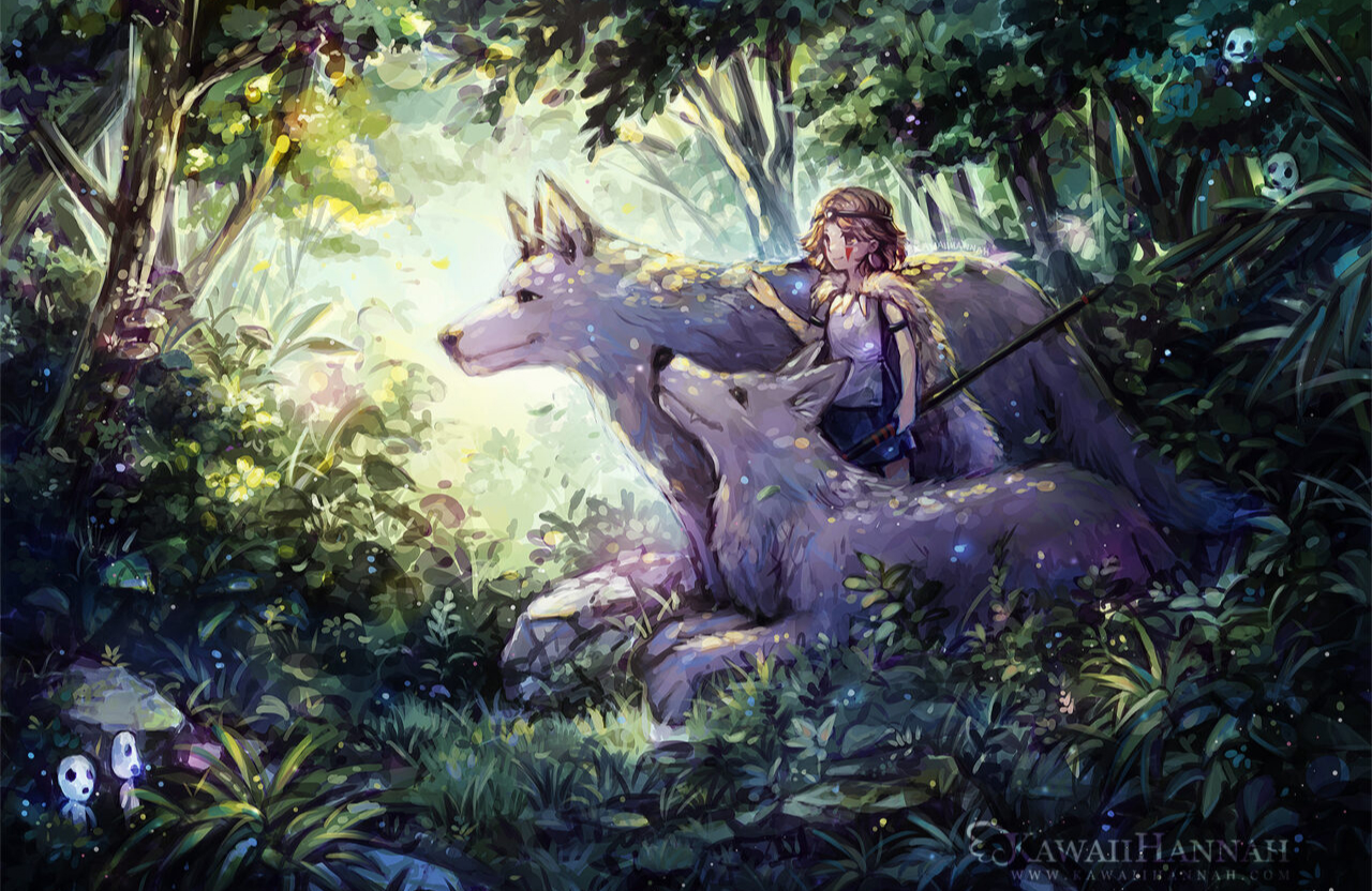
Thumbnail
Used to display an image within the gallery. This behaves differently if the provided image is pixel art or an illustration.
Thumbnail

Thumbnail

Pixelart Modal
This is an example of how a pixel art gallery item is laid out in a modal format.
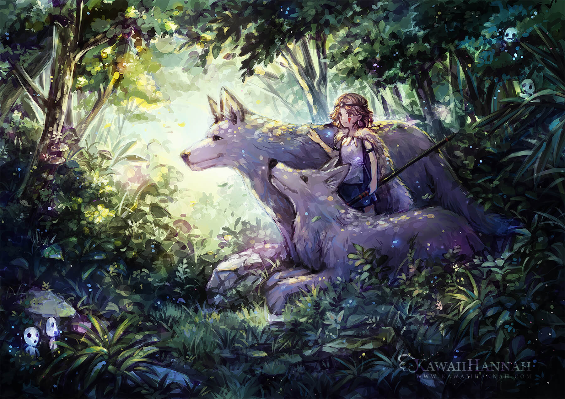
Illustration Modal
This is an example of how a illustration gallery item is laid out in a modal format taking up the full width of the screen.
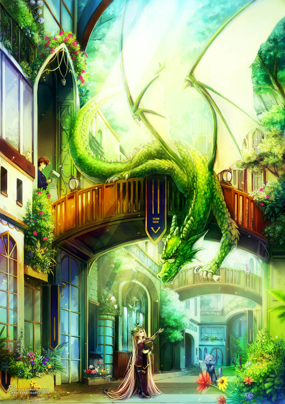
Illustration Modal
This is an example of how a illustration gallery item is laid out in a modal format.
Section
A section is usually a full width component, but can have widths set to show two sections on a single row. Sections are often paired with Flourishes to add decorative elements to the corners. Sections can have a background image set, which is often paired with a fullscreen height for visual impact.
Left Section
When pairing two sections side by side, use the darker colour on the left side. This is an example of using the secondary-dark colour.
Right Section
When pairing two sections side by side, use the base colour on the right side. This is an example of using the secondary colour.